UX/UI Tweak: Increase the visual distance between card index description and card
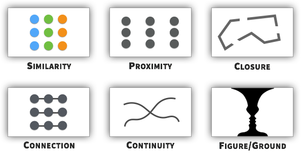
Strategy: DESIGN THE LAYOUT USING GESTALT PRINCIPLES
We’re inundated with stimuli. According to gestalt psychology, we try to overcome that chaos by simplifying our perception. We group things. We categorize elements. We look for the whole.
Some principles include: similarity, proximity, closure, connection, continuity, and figure/ground.
Tactic: Position Headlines Closer to Respective Sections

Source: https://www.nickkolenda.com/user-experience/#ux-strategy3
A violation of the Gestalt principle of "visual proximity":
